Invest smart
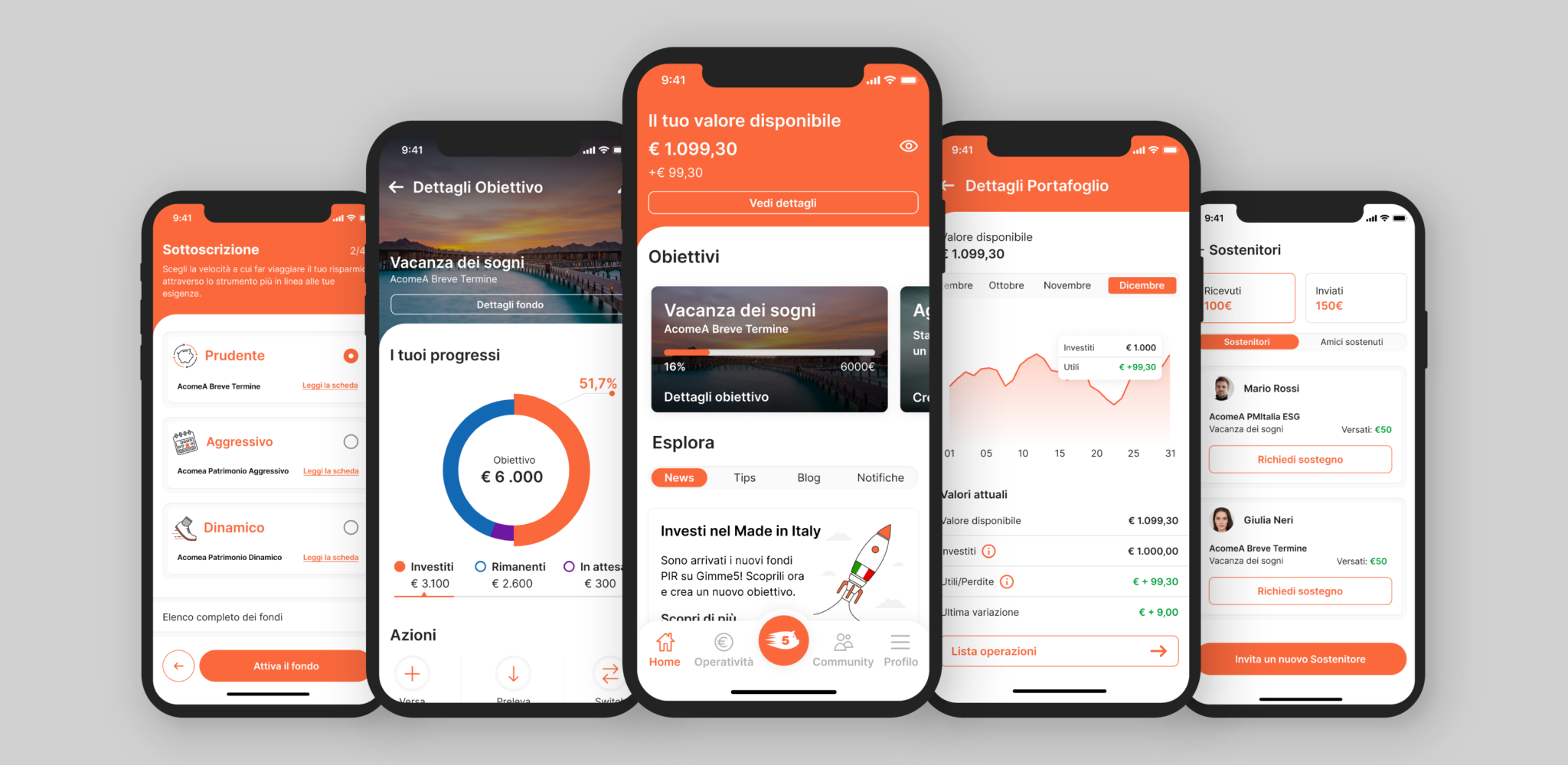
We updated the digital product, making both the mobile app and web application better with a new and improved user interface.
Role
UX-UI designer
Collaborators
Flavio Talarico
Fabio Arlati
Stefano Fotuna
The Wave Studio
Skills
Product thinking
Design system
Prototype
Visual design
Tools
Figma
Adobe Creative Suite
Maze
Opportunity
In response to an imperative Android update requiring a complete code overhaul, our decision was to revitalize the application. This initiative aimed to enhance the user experience and user interface, addressing critical issues identified while augmenting the application’s existing strengths.
User feedback
• The transactions section isn’t clear
• Long onboarding process
• Absence of community
• Outdated appearance of the user interface
Goal
• Simplify and enhance the app for first-time users
• Improve visual organization and information hierarchy efficiency
• Modernize and make the app and web app more accessible
Success metrics
• Onboarding success rate
• Reduced time for specific tasks
• Improved perception of simplicity and modern design
The Process

Following the compilation of crucial customer feedback collected over the past two years, we discerned key insights that prompted us to embark on brainstorming sessions for new sections and modifications to enhance the application. The next step involved developing the Site Map in conjunction with the creation of a new Design System, which was shared collaboratively with colleagues and developers. Subsequently, we meticulously crafted UX flows, progressing seamlessly into UI development. We commenced this process with the mobile app before extending the improvements to the web app. To refine our approach, we concluded by creating prototypes for individual sections, conducting User Tests to gather valuable insights for further modifications to both the app and the web application.
The solution
A new platform
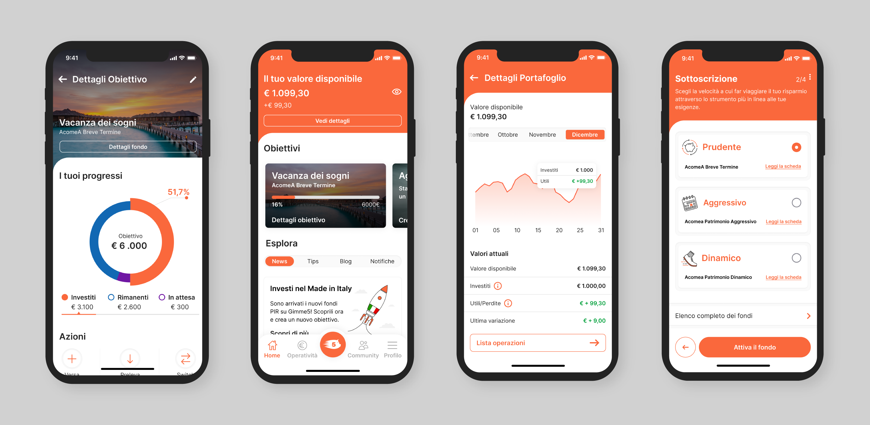
We create a straightforward, customizable, and user-friendly platform, facilitating quick and intuitive interactions with its diverse elements. Furthermore, we implemented an intuitive and modern Design System to ensure consistency across the entire platform.
Onboarding
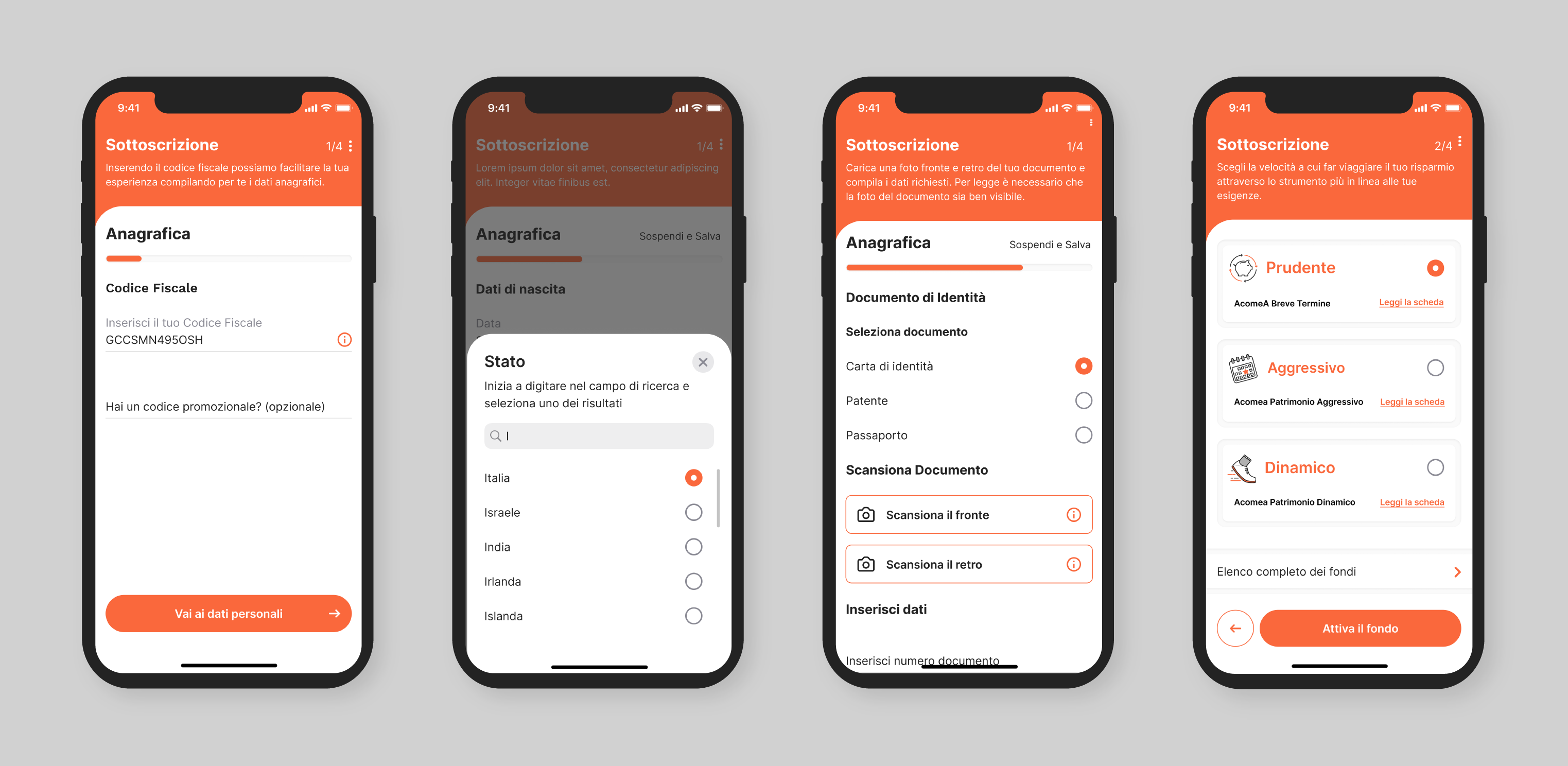
We incorporated innovative features like the timeline, microinteractions, and enhanced flexibility in the onboarding process. These additions contributed to the creation of a more seamless and step-by-step onboarding experience for users.
Transaction section
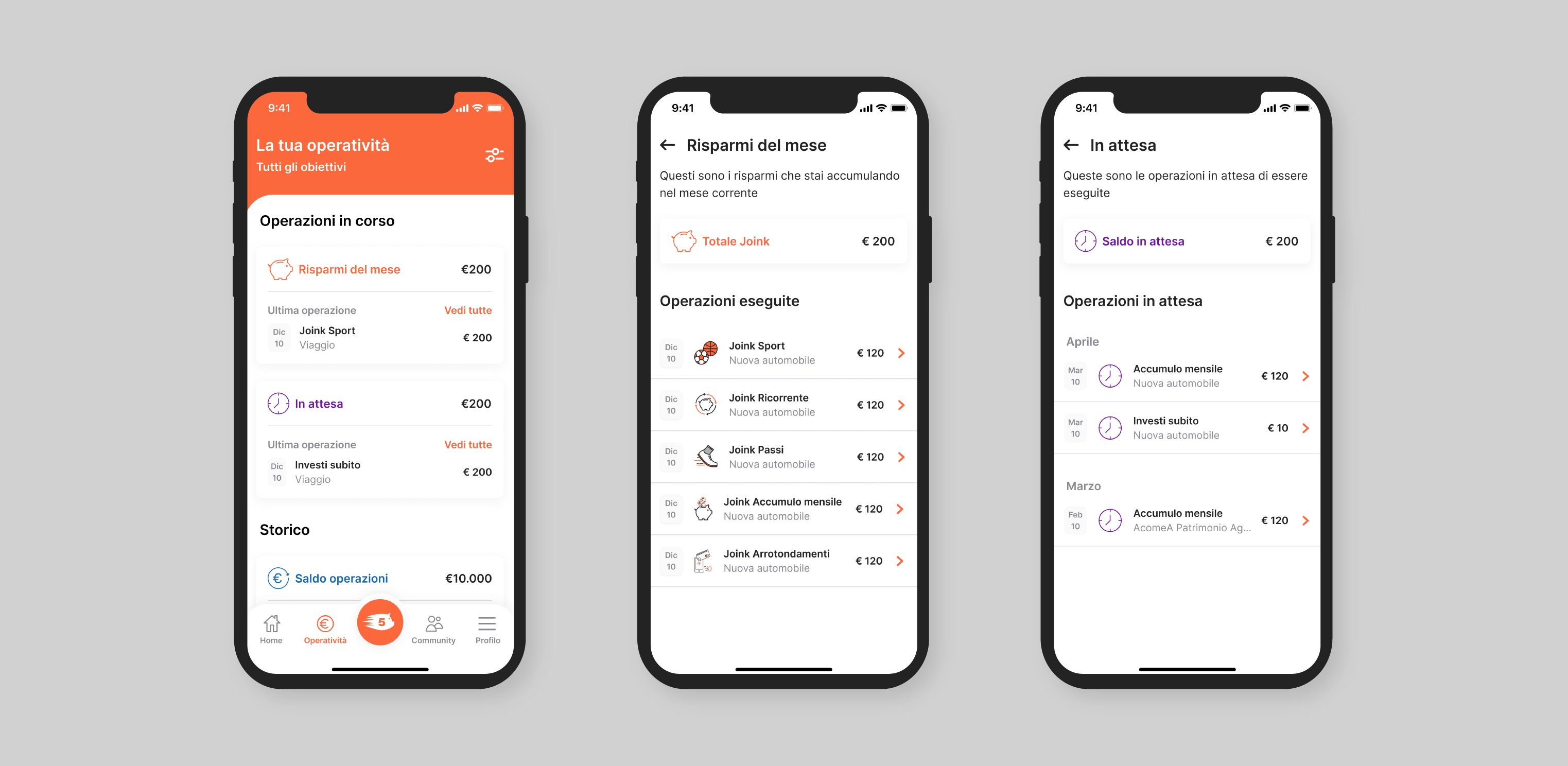
The redesign of the transaction section was meticulously executed with a focus on presenting information to the user in the clearest and most efficient manner. We introduced a progressive disclosure approach to unveil information progressively, ensuring an intuitive user flow and an excellent overall user experience.
Community
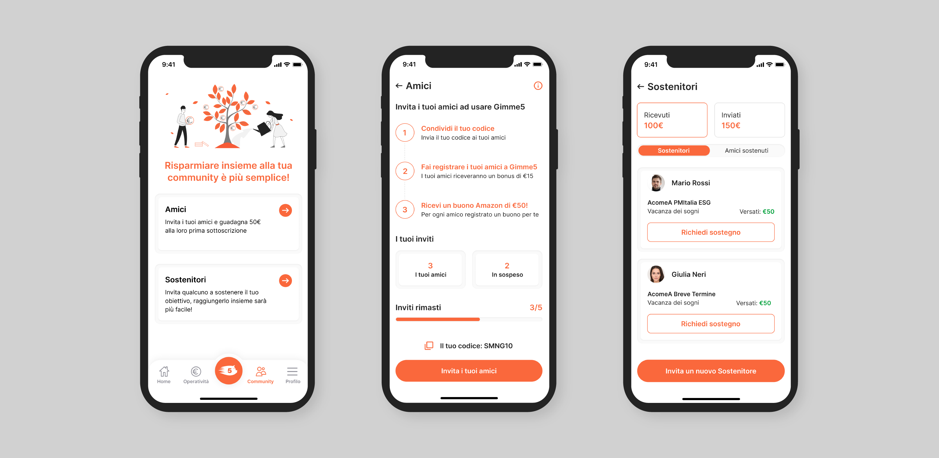
In the revamped community section, we’ve introduced two distinct segments: “Friends,” functioning as a customer acquisition tool through a member-get-member approach, and “Sustainer,” enabling users to send or receive money for their savings goals.
The results
Onboarding
• Achieved a +15% increase in the conversion rate across the entire onboarding funnel • Reduced customer service inquiries related to onboarding doubts by a -30%
App perception
• Survey results indicate a +23% improvement in the app’s perceived modernism and clarity • -12% decrease in customer service inquiries regarding platform-related doubts • Increased user engagement with +8 additional interactions within the app
Marketing assets
Collaborating with the marketing team, we partnered with an external agency to create compelling videos that highlight the platform’s redesign.
Example of a video for adquisition of new leads and clients.
Example of a video tutorial of one of the new features.
Lets get in touch
If you want to know more don’t hesitate to shoot me a message on LinkedIn.